You can make distribution plots in Seaborn with the following code. The given examples help you to understand how to make distribution plots. I highly recommend you “Python Crash Course Book” to learn Python. In this article, you’ll see four distribution plots.
- Displot in Seaborn
- Jointplot in Seaborn
- Pairplot in Seaborn
- Kernal Density Estimate (KDE)
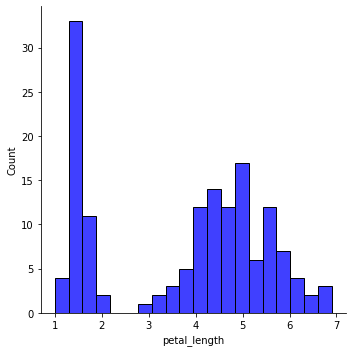
Example 1: Displot in Seaborn
# Import the required libraries
import seaborn as sns
import matplotlib.pyplot as plt

# load the dataset
df = sns.load_dataset('iris')

# Create Displot
sns.displot(df['petal_length'], kde = False, color ='blue', bins = 20)

# Display the plot
plt.show()
Output:
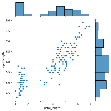
Example 2: Jointplot in Seaborn
# Import the required libraries
import seaborn as sns
import matplotlib.pyplot as plt

# load the dataset
df = sns.load_dataset('iris')

# Create Jointplot
sns.jointplot(x ='petal_length', y ='sepal_length', data = df)

# Display the plot
plt.show()
Output:
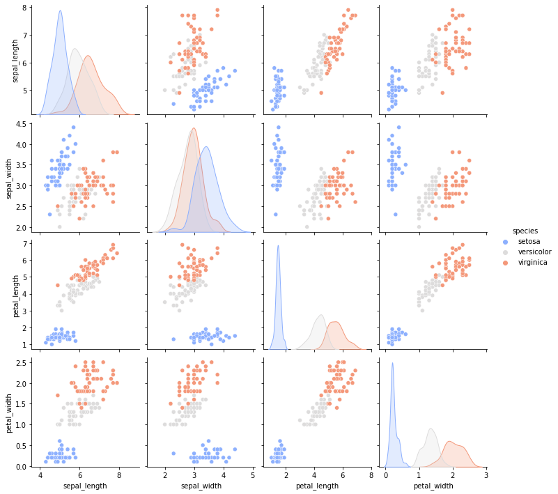
Example 3: Pairplot in Seaborn
# Import the required libraries
import seaborn as sns
import matplotlib.pyplot as plt

# load the dataset
df = sns.load_dataset('iris')

# Create Pairplot
sns.pairplot(df, hue ="species", palette ='coolwarm')

# Display the plot
plt.show()
Output:
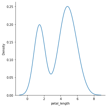
Example 4: Kernel Density Estimate KDE
# Import the required libraries
import seaborn as sns
import matplotlib.pyplot as plt

# load the dataset
df = sns.load_dataset('iris')

# Create Kernel Density Estimate (KDE)
sns.displot(data=df, x="petal_length", kind="kde")

# Display the plot
plt.show()
Output: