You can plot the confusion matrix in Seaborn with the following code. The given examples help you to understand how to make a confusion matrix in Python using Seaborn. I highly recommend you “Python Crash Course Book” to learn Python.
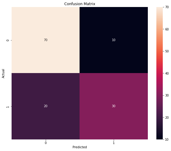
Example 1: Simple Confusion Matrix
# Import the required libraries
import seaborn as sns
import matplotlib.pyplot as plt

# Data
a = [[70, 10],
     [20, 30]]

# Select Confusion Matrix Size
plt.figure(figsize = (10,8))

# Create Confusion Matrix
b = sns.heatmap(a, annot=True)

# Set the Title
b.set(title='Confusion Matrix')

# Set the Labels
b.set(xlabel='Predicted', ylabel='Actual')

# Display the Confusion Matrix
plt.show()
Output:
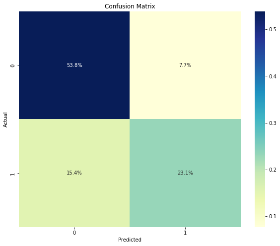
Example 2: Confusion Matrix Percentages
# Import the required libraries
import seaborn as sns
import matplotlib.pyplot as plt
import numpy as np

# Data
a = [[70, 10],
     [20, 30]]

# Select Confusion Matrix Size
plt.figure(figsize = (10,8))

# Create Confusion Matrix and show percentages
b = sns.heatmap(a/np.sum(a), annot=True, fmt='.1%', cmap='YlGnBu')

# Set the Title
b.set(title='Confusion Matrix')

# Set the Labels
b.set(xlabel='Predicted', ylabel='Actual')

# Display the Confusion Matrix
plt.show()
Output:
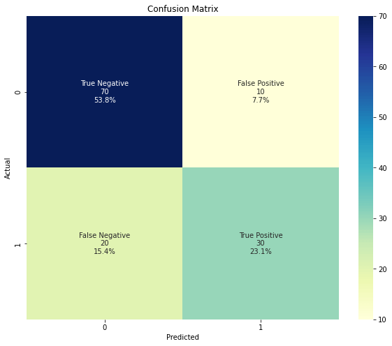
Example 3: Show classes, values, percentages
# Import the required libraries
import seaborn as sns
import matplotlib.pyplot as plt
import numpy as np

# NumPy array
a = np.array([[70, 10],
              [20, 30]])

# Select Confusion Matrix Size
plt.figure(figsize = (10,8))

# Set names to show in boxes
classes = ["True Negative","False Positive","False Negative","True Positive"]

# Set values format
values = ["{0:0.0f}".format(x) for x in a.flatten()]

# Find percentages and set format
percentages = ["{0:.1%}".format(x) for x in a.flatten()/np.sum(a)]

# Combine classes, values and percentages to show
combined = [f"{i}\n{j}\n{k}" for i, j, k in zip(classes, values, percentages)]
combined = np.asarray(combined).reshape(2,2)

# Create Confusion Matrix
b = sns.heatmap(a, annot=combined, fmt="", cmap='YlGnBu')

# Set the Title
b.set(title='Confusion Matrix')

# Set the Labels
b.set(xlabel='Predicted', ylabel='Actual')

# Display the Confusion Matrix
plt.show()
Output:
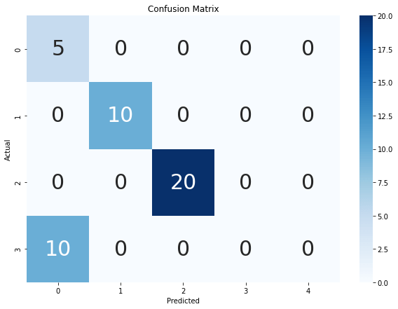
Example 4: Confusion Matrix Multiclass
# Import the required libraries
import seaborn as sns
import matplotlib.pyplot as plt

# Data
a = [[5, 0, 0, 0, 0],
    [0, 10, 0, 0, 0],
    [0, 0, 20, 0, 0],
    [10, 0, 0 ,0, 0]]

# Select Confusion Matrix Size
plt.figure(figsize = (10,7))

# Create Confusion Matrix
b = sns.heatmap(a, annot=True, annot_kws={"size": 30},cmap='Blues')

# Set the Title
b.set(title='Confusion Matrix')

# Set the Labels
b.set(xlabel='Predicted', ylabel='Actual')

# Display the Confusion Matrix
plt.show()
Output: