
You can set the color palette in Seaborn with the following code. The given example helps you to understand how to set the color palette of the Seaborn plot. I highly recommend you “Python Crash Course Book” to learn Python.
Example 1: Set your own colors
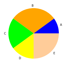
# Import the required libraries
import matplotlib.pyplot as plt
import seaborn as sns

# Define color codes
colors = ["#0000FF", "#FFA500","#00FF00","#FFFF00","#FFCC99"]

# Data
data = [10, 30, 20, 15, 25]

# Labels
labels = ['A', 'B', 'C', 'D', 'E']

# Set Color Palette
sns.set_palette(sns.color_palette(colors))

# Create Pie Chart
plt.pie(data, labels = labels)

# Display Pie Chart
plt.show()
Output:
Example 2: Set predefined color palette (rocket)
# Import the required libraries
import matplotlib.pyplot as plt
import seaborn as sns

# Data
data = [10, 30, 20, 15, 25]

# Labels
labels = ['A', 'B', 'C', 'D', 'E']

# Set Color Palette
sns.set_palette(sns.color_palette("rocket"))

# Create Pie Chart
plt.pie(data, labels = labels)

# Display Pie Chart
plt.show()
Example 3: Set predefined color palette (Paired)
# Import the required libraries
import matplotlib.pyplot as plt
import seaborn as sns

# Data
data = [10, 30, 20, 15, 25]

# Labels
labels = ['A', 'B', 'C', 'D', 'E']

# Set Color Palette
sns.set_palette(sns.color_palette("Paired"))

# Create Pie Chart
plt.pie(data, labels = labels)

# Display Pie Chart
plt.show()