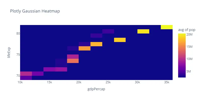
In this Plotly tutorial, you will learn how to plot a gaussian heatmap in Python. The px.density_heatmap() function is used to plot the heatmap.
# Import Plotly Module
import plotly.express as px

# Import Dataset
dataset = px.data.gapminder().query("continent=='Oceania'")

# Gaussian Heatmap
plot = px.density_heatmap(dataset, x="gdpPercap", y="lifeExp", z="pop", histfunc="avg", nbinsx=20, nbinsy=20, title='Plotly Gaussian Heatmap', height=400, width=800)

# Show the Plot
plot.show()
Output: