In this Plotly tutorial, you will learn how to plot a bar chart in Python. You can use px.bar() function to plot a bar chart.
Example 1
# Import Plotly Module
import plotly.express as px

# Import Dataset
dataset = px.data.gapminder().query("continent=='Oceania'")

# Bar Chart
plot = px.bar(dataset, x="year", y="pop", color='country', title='Plotly Bar Chart', height=400, width=600)

# Show the Plot
plot.show()
Output:

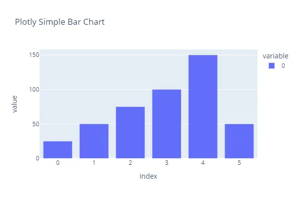
Example 2
# Import Plotly Module
import plotly.express as px

# Data
data = [25, 50, 75, 100, 150, 50]

# Bar Chart
plot = px.bar(data, title='Plotly Simple Bar Chart', height=400, width=600)

# Show the Plot
plot.show()
Output: