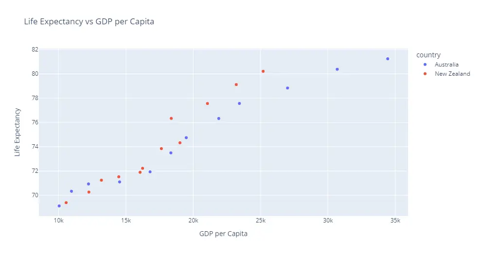
In this Plotly tutorial, you will learn how to set axis labels of plot. You have to use labels parameter for this task.
# Import Plotly Module
import plotly.express as px

# Import Dataset
dataset = px.data.gapminder().query("continent=='Oceania'")

# Axis Labels
plot = px.scatter(dataset, x="gdpPercap", y="lifeExp", color='country', title='Life Expectancy vs GDP per Capita', labels={'gdpPercap':'GDP per Capita', 'lifeExp':'Life Expectancy'})

# Show the Plot
plot.show()
Output: